How To Uncover the Secrets of F1 Pit Stops — A Python-Powered Analysis
Leveraging data analysis to unravel Formula 1 pit stop patterns

Beneath the electric buzz of the neon lights, the pulse of an undeniable shared passion radiated through the room.
Liam and Olivia, each clutching their throw pillows decorated with emblems of their favorite teams, were on the edge of their seats. Their eyes were glued to the screen, watching the Formula 1 race with intense focus and heart-throbbing anticipation.
Liam, always the Ferrari enthusiast, wore his team’s scarlet red t-shirt, while Olivia, a Red Bull devotee, donned a cap with the iconic charging bulls logo.
Both were avid fans of the sport, but today, they were not just spectators — they were investigators, hunters on the trail of a question that had been niggling at their minds.
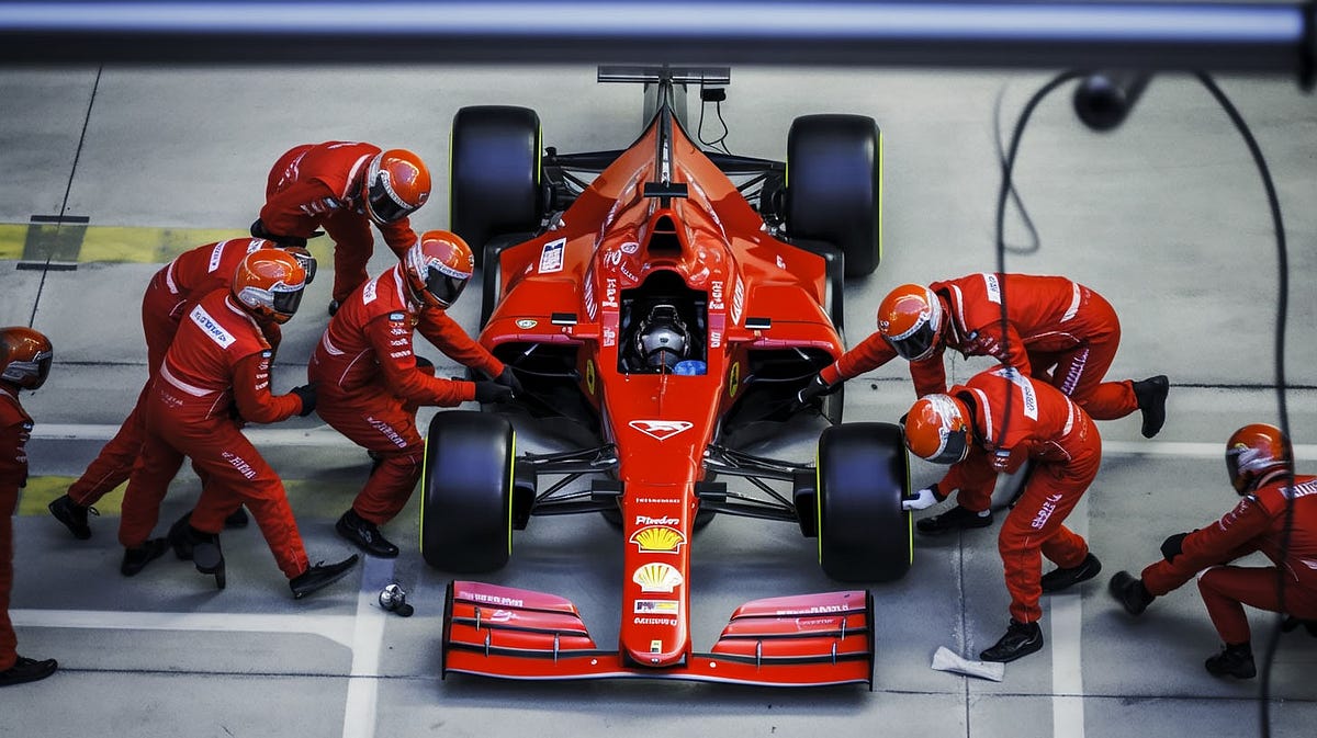
The pit stops piqued their curiosity, those crucial moments of high-stakes choreography that could make or break a race. “It looks like these keep getting faster and faster,” Olivia remarked, her eyes tracking the pit crew’s swift, synchronized movements.
Liam nodded, his brow furrowing in thought. “Is that true? Or does it just look that way?” he wondered aloud.
Olivia, a seasoned Python developer, turned to him with a determined glint in her eyes. “Let’s see if we can verify that,” she proposed. There must be data about Pitstops available on the Web via some API or webpage, she reasoned. And so, their joint investigation into the realm of Formula 1 pit stops began.
This exploration led them down a path that tested their Python skills and understanding of the sport.
As they delved into the data, wrangled with variables, and plotted their findings, they discovered fascinating patterns and insights about the evolution of pit stop times.
This article delves into their journey, showcasing Python's power in data analysis, particularly in answering intriguing questions about pit stops in Formula 1.
The complete suite of Python scripts used for this analysis and the raw data can be accessed through our GitHub repository.
The pit stop
In Formula 1 racing, a pit stop is a pause the racing cars make in the pit box for new tires, minor repairs, mechanical adjustments, a driver change (not in Formula 1), or any combination. The pit stop is crucial and can distinguish between winning and losing a race.
Here’s why pit stops are so important:
- Tire Change: The primary reason for a pit stop in modern F1 races is to change tires. Tires degrade throughout a race due to the extreme speeds and forces involved in F1. Fresh tires provide better grip and, thus, higher speeds. The type of tire used also affects the strategy; some tires offer more speed but degrade faster, while others are slower but last longer.
- Fuel: In the past, cars would also refuel during pit stops. However, refueling during races has been banned since 2010 for safety reasons, so cars now start the race with all the fuel they will need.
- Minor Repairs and Adjustments: Pit stops are also used to make minor repairs and adjustments to the car. This might include adjusting the front wing for better aerodynamics or fixing minor damage.
- Strategic Advantage: Teams use pit stops as strategic elements of the race. The timing of pit stops can play a significant role in a team’s race strategy. Teams will often try to pit at a time that gives their driver a clear track ahead when they rejoin the race, or they might try to undercut their opponents by pitting earlier and taking advantage of fresh tires to make up time.
Despite their importance, pit stops are a high-pressure situation for the pit crew. A typical F1 pit stop can take less than three seconds, and in that time, the pit crew must accurately and efficiently change all four tires.
Any mistakes or delays can cost a driver valuable positions on the track. Consequently, teams practice and perfect their pit stops to ensure they are as quick and smooth as possible.
Gathering the data
Alright, let’s see what we’ve got here,” Olivia mused, tapping her fingers on the keyboard. Her browser was filled with tabs, each a potential treasure trove of Formula 1 data. One of them caught her eye — the Ergast Developer API. It was an experimental service like a time machine for motor racing data. Perfect for folks like her who want to dive into the past for non-commercial purposes.
She found a nifty little endpoint in the API that seemed promising. It was like a secret door that, when opened, would spill out the details of pit stops. Exciting, right?
So, she quickly typed out https://ergast.com/api/f1/2011/5/pitstops/1 in her browser and hit enter.
The data came pouring in. It was a digital maze of numbers and facts about pit stops from the 2011 season. But hold on. Something was off.
Olivia squinted at the screen. Her fingers paused over the keyboard. The ‘duration’ data was not quite what she was expecting.
Instead of giving her the time it took for the pit crew to change tires and perform minor repairs — the stuff that happens when the car is stationary — this ‘duration’ was the total time the car spent from the moment it entered the pit lane to the moment it exited.
“Hmm, that’s not quite right,” Olivia muttered. The duration data was muddied by the varying lengths of the pit lanes at different circuits. That wasn’t what she wanted. She needed the precise pit stop duration, not a pit lane tour!
Just as Olivia was about to get disheartened, she stumbled upon a gem. It was a post by a fellow F1 enthusiast, peke_f1, on the Reddit treasure trove.
The post held the key to a Google Spreadsheet — a spreadsheet that was a gold mine of pit stop data from 2018 to 2020. Moreover, it had precisely what Olivia wanted — the actual pit stop duration!
Olivia couldn’t help but let out a cheer. The spreadsheet was like a neatly wrapped gift from the universe. It was perfect, just what she needed to fuel her data analysis.
But wait, there’s more. As she dug into the Reddit post, Olivia discovered that the data came from DHL, a major sponsor. Apart from delivering packages, DHL also had a knack for providing some thrilling F1 action.
They did this by hosting the DHL Fastest Pit Stop Award, an unofficial competition that added excitement to the races. The competition was simple — points were awarded for the fastest pit stop, and at the end of the season, the team with the most points took home the award.
Olivia’s eyes lit up as she read about the award. She could almost see the pit crews bustling around, their movements perfectly synchronized as they raced against the clock. The website even displayed the actual times of the team’s pit stops. But alas, despite her best efforts, she couldn’t find the API that peke_f1 had referred to.
“No matter,” Olivia said, a determined sparkle in her eyes. The Google Spreadsheet was a solid starting point for her data analysis. The game was on.
Cleaning the data
With a few clicks, Olivia smoothly transitioned the spreadsheet into a CSV file. She knew this was the easiest format to work with in Python — it was like the bread and butter of data analysis.
“Alright, time to roll up the sleeves,” she said. She’d been around the data block long enough to know it wasn’t all sunshine and rainbows. Before diving into the cool stuff — the actual analysis — there was always the initial, slightly tedious data-cleaning phase. The data you got was often raw, messy, and filled with outliers or missing values. Cleaning it up was a necessary evil that couldn’t be skipped.
But as Olivia scanned the CSV file, she noticed something astonishing. The data was… clean. Impeccably clean. It was like walking into a room expecting a pile of dirty laundry and finding it spotless instead. There were no missing values, no outliers, nothing out of place. The data was ready to be processed, and Olivia was prepared to dive in. It was a dream come true for any data analyst.
First data analysis
First thing on the agenda: get a feel for the data. Olivia decided to run a simple calculation — the average pit stop time per team for a Grand Prix. This was like the data’s first impression — it would give her a solid overview and confirm that the data was making sense.
She cracked her fingers and got to typing, whipping up a Python script that leveraged the power of pandas. Here’s what her code looked like:
import pandas as pd

# Pull in the CSV data into a DataFrame. Think of it as a super-powered Excel sheet in Python.
df = pd.read_csv('./pitstops-data/pitstops-data.csv')

# Let's focus on just the Australian Grand Prix for now.
aussie_gp = df[df['GRAND_PRIX'] == 'Australian Grand Prix']

# Group the DataFrame by team, calculate the average pit stop duration.
pit_stop_avgs = aussie_gp.groupby('TEAM_SEASON')['PIT_DUR'].mean()

# Let's tidy up. Sort the times from fastest to slowest.
pit_stop_avgs = pit_stop_avgs.sort_values()

# Round the durations to two decimal places for a cleaner look.
pit_stop_avgs = pit_stop_avgs.apply(lambda x: round(x, 2))
pit_stop_avgs = pit_stop_avgs.apply(lambda x: '{:.2f}'.format(x))

# Time to see the results!
print(pit_stop_avgs)
She hit run and held her breath as the code executed. A few seconds later, her results popped up. They made sense, looked correct, and gave Olivia that first burst of confidence — she was on the right track. The data was behaving, and she was ready to dig deeper.

Olivia’s next objective was to plot a line graph illustrating the average pit stop duration per team throughout a season. This visualization would reveal any improvements or regressions in a team’s pit stop efficiency as the season progresses.
She focused on three top teams: Red Bull, Mercedes, and Ferrari. This choice was made to maintain clarity and simplicity in the visualization. To further enhance the aesthetic quality of the graph, she employed the Seaborn Library for its elegant default styles and color palettes.
Below is the Python script she used:
import pandas as pd
import matplotlib.pyplot as plt
import seaborn as sns
# Set Seaborn style for enhanced aesthetics
sns.set_theme()
# Load the data
df = pd.read_csv('./pitstops-data/pitstops-data.csv')
year = 2018
# Convert the 'DATE' column to datetime format
df['DATE'] = pd.to_datetime(df['DATE'])
teams_to_include = ['Red Bull', 'Ferrari', 'Mercedes'] # adjustable team list
# Filter for the 2018 season, include only regular pit stops, and select the specified teams
df = df[(df['SEASON'] == year) & (df['PIT_IRREGULAR'] == False) & (df['TEAM_SEASON'].isin(teams_to_include))]
# Sort the DataFrame by date
df = df.sort_values(by='DATE')
# Group by the grand prix and team, calculate the average pit stop duration
grouped = df.groupby(['GRAND_PRIX', 'TEAM_SEASON'])['PIT_DUR'].mean()
# Convert the grouped data into a DataFrame where each column is a team, and each row represents a grand prix
unstacked = grouped.unstack()
# Sort the grand prix in chronological order
unstacked = unstacked.sort_index()
# Define a color map for the teams
color_map = {'Red Bull': 'mediumblue', 'Ferrari': 'crimson', 'Mercedes': 'gray'}
width_map = {'Red Bull': 2.5, 'Ferrari': 1, 'Mercedes': 1}
# Initialize the plot
plt.figure(figsize=(15, 10))
for team in unstacked.columns:
plt.plot(unstacked.index, unstacked[team], label=team, color=color_map[team], linewidth=width_map[team])
# Set plot configurations
plt.xticks(rotation=45)
plt.xlabel(f'Grand Prix - {year}', fontsize=14)
plt.ylabel('Average Pit Stop Time (seconds)', fontsize=14)
plt.legend(bbox_to_anchor=(1.05, 1), loc='upper left', title='Teams', title_fontsize='13', fontsize='12')
plt.grid(True, which='both', linestyle='--', linewidth=0.5)
plt.title('Average Pit Stop Time by Team across Grand Prix', fontsize=16, y=1.05)
plt.tight_layout()
plt.ylim(1.7,5)
# Render the plot
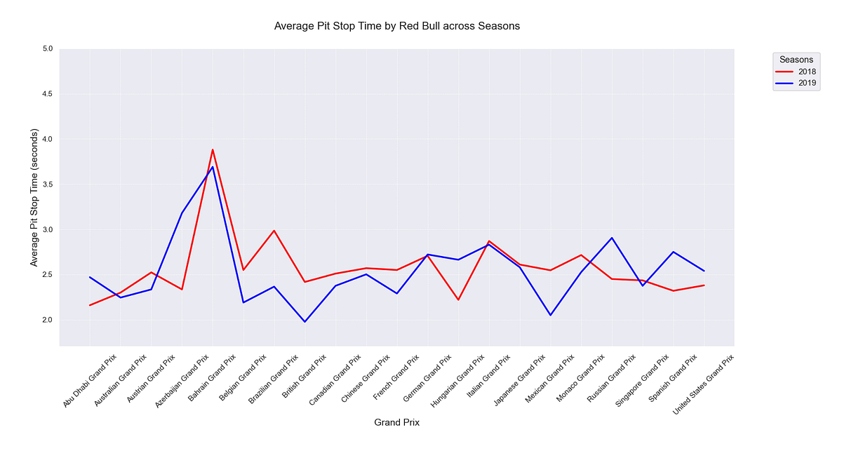
plt.show()Executing this script yielded the following graph:

Olivia invited Liam to examine the graph she had generated. “Take a look at this,” she suggested. Liam studied the chart, his gaze moving along the lines. “So, it seems that Red Bull, on average, has the quickest pit stops throughout the season,” he observed. “But I’m not seeing any clear improvement trends over time.”
He squinted at the lines, noting the variations. “There are a few instances where the times slow down, not just for Red Bull but the other teams as well,” he pointed out. “Sometimes, they’re even brushing up against the two-second mark.”
Liam paused, the wheels turning in his mind. “This data is insightful, but I’m curious about the subsequent years. Could we also extend the analysis to include those?” he asked Olivia.
Olivia’s fingers flew across the keyboard, swiftly making the necessary changes to the script. The updated graph materialized on the screen as she hit' execute.’ Still marveling at Olivia's speed and efficiency in transforming the data, Liam turned his attention to the graph. “Wow, this is fascinating,” he observed. “Red Bull improved their performance in 2019, even hitting the two-second mark during the Brazilian Grand Prix”.
Liam turned to Olivia, his eyes shining with curiosity. “I’m intrigued, Olivia,” he said, leaning closer to the screen. “With all this data at our disposal, I can’t help but wonder what other insights we might uncover. What else do you think we could explore?
Deepening the Analysis
Pivoting to a broader perspective, Olivia decided to encapsulate the pit stop durations for each team into a single visualization. The tool of choice for this task was a boxplot, a representation that would encapsulate the distribution of pit stop times for each team.
To accomplish this, she created the following Python script:
import pandas as pd
import matplotlib.pyplot as plt
import seaborn as sns

# Data loading
df = pd.read_csv('./pitstops-data/pitstops-data.csv')

# Conversion of 'DATE' column to datetime format
df['DATE'] = pd.to_datetime(df['DATE'])

# Select the teams to analyze
teams_to_include = ['Red Bull', 'Ferrari', 'Mercedes', 'Williams', 'Renault', 'McLaren', 'Alfa Romeo', 'Haas', 'AlphaTauri']  # customizable team list

# Filter for regular pit stops and selected teams
df = df[(df['PIT_IRREGULAR'] == False) & (df['TEAM_SEASON'].isin(teams_to_include))]

# Order the DataFrame chronologically
df = df.sort_values(by='DATE')

# Establish a theme for the plot
sns.set_theme(style="whitegrid")

# Generate a color palette
palette = sns.color_palette("hls", len(teams_to_include))

# Initialize the plot
plt.figure(figsize=(15, 10))

# Construct the boxplot
sns.boxplot(x='TEAM_SEASON', y='PIT_DUR', data=df, order=teams_to_include, palette=palette)

# Set title and labels
plt.title(f'Pit Stop Duration by Team (2018,2019,2020)', fontsize=20)
plt.xlabel('Team', fontsize=15)
plt.ylabel('Pit Stop Duration (seconds)', fontsize=15)
plt.ylim(1.3,5)

# Render the plot
plt.show()
The execution of the above script resulted in the boxplot below, giving a comprehensive snapshot of pit stop durations for each team.

With an itch to uncover more insights, Olivia decided to explore potential patterns in average pit stop times across different circuits. She quickly whipped up a Python script to crunch the numbers.
import pandas as pd
import matplotlib.pyplot as plt
import seaborn as sns
# Load the data
df = pd.read_csv('./pitstops-data/pitstops-data.csv')
# Convert the 'DATE' column to datetime format
df['DATE'] = pd.to_datetime(df['DATE'])
# Filter out irregular pit stops
df = df[df['PIT_IRREGULAR'] == False]
# Group by circuit and calculate the average pit stop duration
grouped = df.groupby('CIRCUIT')['PIT_DUR'].mean()
# Convert the grouped data to a DataFrame
circuit_averages = pd.DataFrame(grouped).reset_index()
# Sort the circuits by average pit stop duration
circuit_averages = circuit_averages.sort_values(by='PIT_DUR')
# Plot the results
plt.figure(figsize=(10, 6))
sns.barplot(x='PIT_DUR', y='CIRCUIT', data=circuit_averages, palette='viridis')
# Set plot configurations
plt.xlabel('Average Pit Stop Time (seconds)', fontsize=14)
plt.ylabel('Circuit', fontsize=14)
plt.title('Average Pit Stop Time per Circuit', fontsize=16, y=1.05)
# Render the plot
plt.tight_layout()
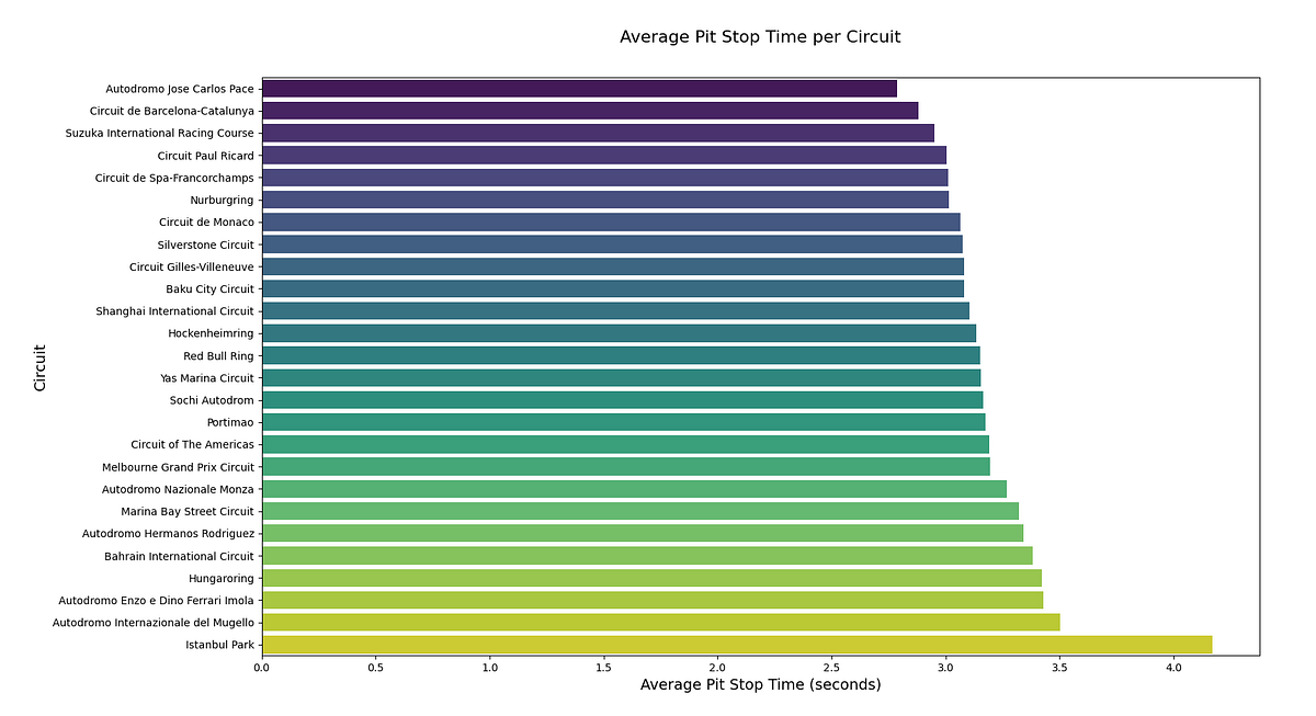
plt.show()Once the script had done its magic, a bar graph popped up on the screen. It was a visual representation of average pit stop times across various circuits, each bar bearing the name of a circuit and its corresponding average pit stop time.
She beckoned Liam over, pointing at the newly generated plot. “Check this out,” she said, her eyes sparkling with curiosity.
Liam squinted at the screen. “What am I seeing here?” he asked.
“That,” Olivia said with a flourish, “is a graph of average pit stop times for each circuit.”
Liam’s brow furrowed. “Interesting… but what does it mean?”
Olivia shrugged, her smile undimmed. “Well, that’s the beauty of data. It shows us patterns and outliers like Istanbul Park but doesn’t always explain why. For that, we might have to dive into the history books or look for additional data.” She winked at Liam, clearly excited about the next phase of their data exploration journey.
Olivia and Liam’s analytical journey reached its finale as the graph materialized on their screen. The conclusion was irrefutable — the average duration of pit stops had become progressively quicker over the years.
The hunt for this particular piece of data had sparked Olivia’s analytical appetite, stoking the embers of her curiosity for more Formula 1-related insights.
With many new ideas brewing, it was evident that their data-driven adventures were far from over. Stay tuned for their next venture, where Olivia and Liam will embark on another thrilling exploration of the world of Formula 1 in the forthcoming article.
Conclusion
Exploring Formula 1 pit stop data, guided by Python-powered data analysis, has provided intriguing insights into the sport’s strategies and mechanics.
We have highlighted pit stops' critical role by systematically compiling and examining data, including the average pit stop duration, evolution over time, and variances across different circuits.
Moreover, the journey has underscored the potential of Python as a tool for parsing and visualizing complex datasets. This, in turn, opens up opportunities for further research, such as understanding the unique characteristics of specific circuits or the implications of regulatory changes.
Armed with this data, fans like Olivia and Liam can enjoy an enhanced perspective of their favorite sport, further deepening their engagement with and understanding of Formula 1.
Code and resources
The complete suite of Python scripts used for this analysis and the raw data can be accessed through our GitHub repository.
Further, the following resources were used for research, inspiration, and data:
- The spreadsheet with pit stop data from Reddit
- The Ergast API
- Fast F1 Python library
- Kaggle Formula 1 data set
- Top 20+ Kaggle Datasets for Formula 1 fan
Happy coding!